Photorealistic Pure CSS iPhone
I made an iPhone. Here’s how:
Structure
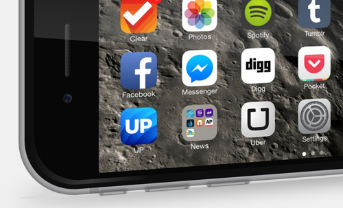
The structure is heaps simpler than it looks. It’s built with a series of nested divs, each with a large border-radius and a bit of padding. On the face of the device we have three inline-block elements, comprising the camera, the screen, and the home button.
<div class="wrap">
	<div class="metal-casing">
		<div class="bezel">
			<div class="front">
				<div class="cam-speaker-wrap">
				</div>
				<div class="screen">
				</div>
				<div class="button-wrap">
				</div>
			</div>
		</div>
	</div>
</div>
Highlights
Pseudo-elements are your friend. They’re such a powerful tool for adding graphic details while keeping your HTML clean and semantic. Highlights for side buttons and camera lens:
See the Pen aOQyPL by Sam R (@samratcliffe) on CodePen.
Animation
A bit of CSS animation can bring the phone to life. The wrapper div is given a very simple rotate3d() transform around the y axis.
@keyframes swing {
	0% {
		transform: rotate3d(0, 1, 0, -10deg);
	}
	50% {
		transform: rotate3d(0, 1, 0, 20deg);
	}
	100% {
		transform: rotate3d(0, 1, 0, -10deg);
	}
}
.wrap {
  animation-name: swing;
  animation-duration: 4s;
  animation-iteration-count: infinite;
}
The reflection is given another rotation in the opposite direction to make the lighting look more striking:
@keyframes reflectShift {
	0% {
		transform: rotate3d(0, 0, 1, -3deg);
	}
	50% {
		transform: rotate3d(0, 0, 1, 6deg);
	}
	100% {
		transform: rotate3d(0, 0, 1, -3deg);
	}
}
.front::after {
  animation-name: reflectShift;
  animation-duration: 4s;
  animation-iteration-count: infinite;
}
And that’s basically it. Take a look at the codepen for more info.